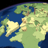
 There exists many methods for geovisualization of spatial phenomena. As talked about a few weeks ago, population density can be mapped out using cartograms, or by other more classical methods, such as the chloropleth and dot density techniques. Another method is shown below, whereby population density is explored as a 3-dimensional polygon extrusion. This has been completed using ArcGlobe with ESRI basic world population-by-state data. Have a look at the video below!
It works best on a slow connection if you buffer the video first.
I’ve added a hypsometric colouring scheme to help emphasize the differences in population density values, and specifically, to create separation between low and high values.
Cheers!
