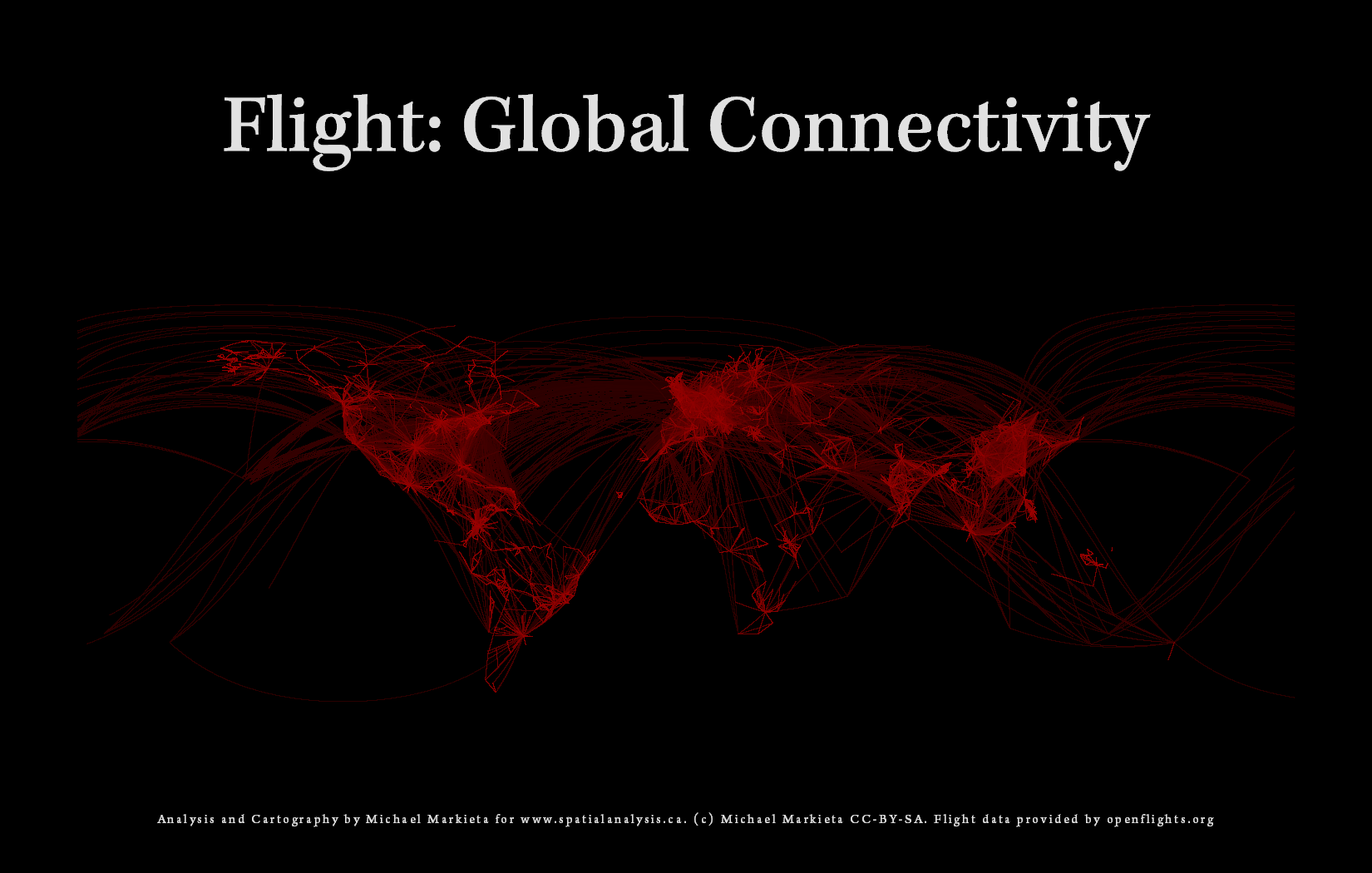
 After having seen the many iterations of the global connectivity map, I have decided to give it a try myself. The maps are being produced using this data, which offers public air-traffic data in tabular format. The data is available in three categories: airports, airlines and routes. The airports and routes data can be manipulated, combined and cleaned-up to create a complimentary table that lists the longitude and latitude of each flights origin and destination. This allows us to connect each flight origin and destination. However, straight lines of connectivity would create a messy and aesthetically appalling map. By using great arc circles as our method for creating the aforementioned lines of connectivity, we can create an atypical flight route map.
The Map!
The map has been created in ArcMap using the symbol levels technique. This allows us to create a hierarchy of symbol levels such that the longer more obtrusive flight paths are drawn below the shorter flights paths. I’ve also taken the liberty to customize the colouring scheme such that the longer flights are drawn in a less prominent (dark)red. As the flights become shorter in length you will notice that they also become lighter in hue. This helps separate the 14,000+ paths of flights from January of 2008 the database that was created many years ago (note: the map title and the original posting was stated incorrectly).
Full size available here: click me!
Some thoughts:
The openflights data package contains more than 50,000 flight paths for January 2008 since the database was created, however I had trouble manipulating the data to produce lat/long for each origin and destination. Therefore, I am left with a sample of the total routes to display on the map. Notwithstanding the setback, I believe that the map has produced an effective result.
I should also note that even though this map uses a sample subset of the total number of flights, we can still clearly make out many of the continents and major regions around the world! I find it very neat that its possible to make out the general shapes without any underlying base map of the world with just a sample of the flights.
As mentioned early, there are many iterations of the global connectivity map. Some use the openflights data and some use various other sources. An example of other sources of global connectivity is shown by James Cheshire, who posted a vary nifty map, which display a sample of the 2007 global migration patterns.
I haven’t decided if I want to write a tutorial that would reproduce this map because there are plenty of sources out there at the moment which discuss the technique. Please feel free to visit Paul Butler’s page which shows the ever-so-famous Facebook Friends connectivity map. Also there is great documentation and discussion on how to use R Project for Statistical Computing to create a global connectivity map using great arc circles here.
Cheers!
Check out the update to this post here!
If this post helped you and you enjoy my site I would happily accept Litecoin donations:
LKPfT772e9HxvXYcA8LVDctTmENoqQxQF3


[…] Spatial Analysis Mapping with Michael Markieta Skip to content HomePortfolioAbout Me ← Open Flights; Mapping Global Connectivity […]
Hi Michael
I work for an engineering consultancy, Berger Group, and am working on our quarterly publication, BergerWorld, which will feature our Global Aviation Projects.
Would it be possible to use one of your Global Air Routes Mappings? I would need a high res file.
Considering this for a cover idea.
Very cool.
karen
HI Michael,
Hope your well. I am looking to use a map of flight patterns across the globe in project I am working on. I would like to use it as a backdrop in a shop window. I was wondering if you could give me permission to use one of yours, as I don’t want to break any copy write laws. If so please let me know and would it be possible for you to send me large version of the file?
Kind Regards
Claude Marcos